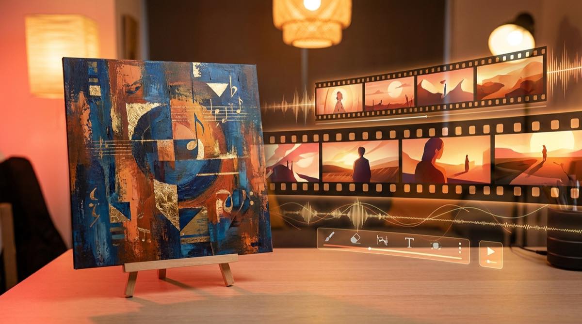
A strong cover image can do more than sit at the start of a track. It can become the visual anchor for the whole video. If you are making a cover image music video, the job is not to stretch one picture until it gets boring. The job is to use that image as the source of the world, then let the song move through it.
This matters because many artist videos drift. The first shot looks like the cover. The second shot has a different face. The third shot changes the clothes, lighting, mood, and camera style. By the time the chorus arrives, the video feels like a random set of AI clips.
A cover image can prevent that. It gives the video a face, a palette, a place, and a promise. SceneLore works best when you treat the image as the creative brief, not just as an upload.
Start by reading the cover like a director
Before you make scenes, describe what the cover already gives you. Do this in plain language.
Who is in the image? What are they feeling? Where are they? What time of day is it? What colors dominate? Is the camera close and intimate, or wide and cinematic? Is the energy dreamy, angry, lonely, romantic, playful, or cold?
Those answers become the rules of the video. If the cover shows a singer under red neon in a wet street, the next scenes should not suddenly jump to bright desert shots unless the song clearly needs that contrast.
Write a short visual sentence before you generate anything. For example: "A lonely singer in a blue night city, filmed close, with reflections, slow camera movement, and a feeling of distance."
That sentence is more useful than a long prompt full of style words. It gives each scene something to obey.
Keep the main subject stable
The biggest risk with a single image music video is identity drift. The artist, character, or object changes from shot to shot. Viewers may not describe it that way, but they feel it. The video becomes harder to trust.
Use the cover image as the identity reference. Keep the same face, silhouette, clothing family, hair, and color logic. You do not need the exact same pose in every shot. In fact, that would feel stiff. You need enough continuity that the viewer believes each moment belongs to the same release.
A good test is simple. If you pause the video at random moments, would someone believe they came from the same song package? If the answer is no, the scene plan is too loose.
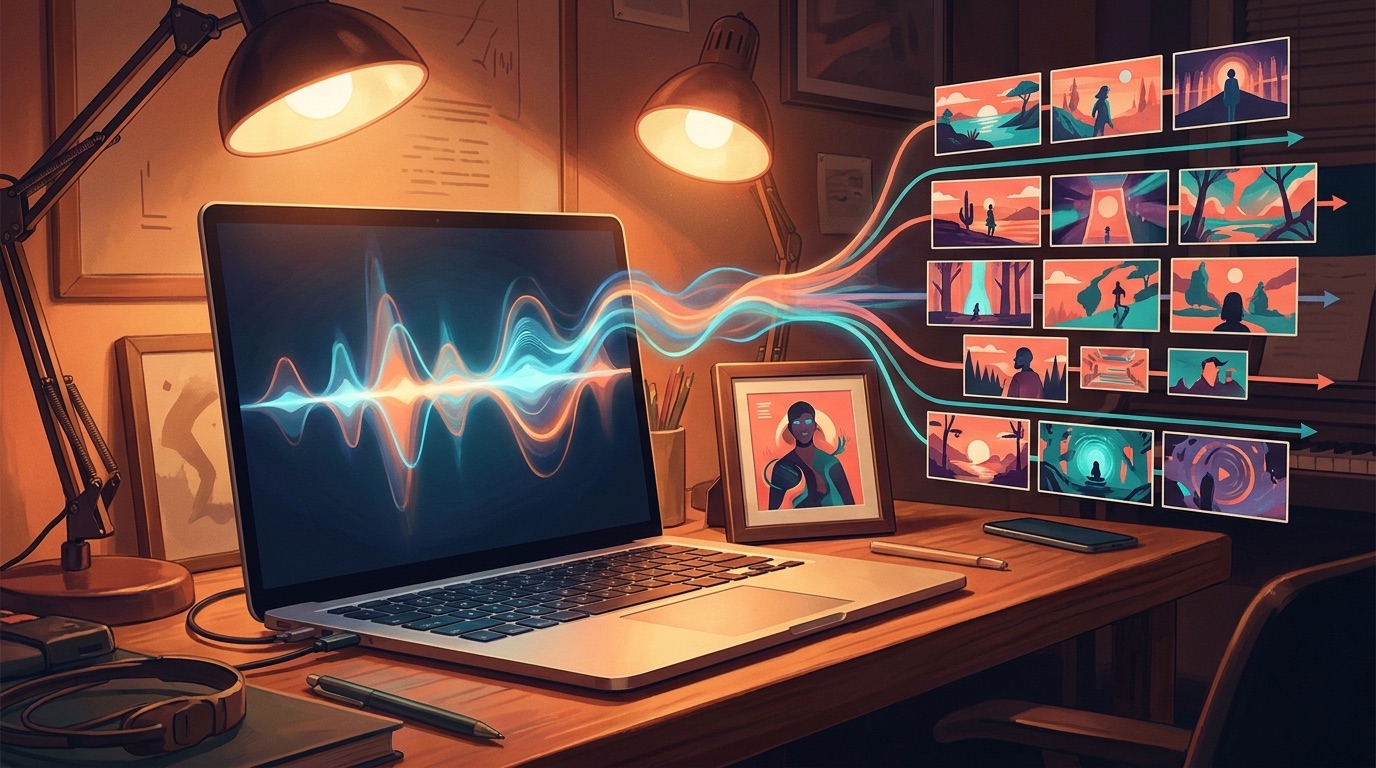
Turn the song into a small scene list
Do not ask one image to carry four minutes by itself. Break the track into a few visual beats.
The intro may stay close to the cover world. The first verse can show small movement: a walk, a glance, lights passing across the face, a room slowly changing. The chorus can open the frame and give the image more scale. A bridge can add a memory, a second location, or a visual twist, as long as it still feels connected to the cover.
For most songs, five to eight scene ideas are enough. More scenes can make the video feel busy. Fewer scenes can make it feel static.
A simple structure works well: establish the cover world, show the subject moving through it, widen the emotion in the chorus, then return to the strongest visual idea near the end. The goal is to make the artwork feel alive for the length of the track.
Use motion that matches the music
A cover image music video fails when the motion ignores the song. Fast camera moves over a quiet piano track feel cheap. Slow drifting shots over a hard chorus can feel flat.
Listen for the shape of the track. Does it build slowly? Does the chorus hit hard? Are there repeated lyric phrases? Is there a drop, a break, or a final lift? Those moments tell you where the image should change.
Small motion can be enough. Rain moving in the background. A hand touching a microphone. Neon reflected in a window. A camera push toward the face before the chorus. These details often work better than forcing every shot to become an action scene.
The cover image is already carrying the brand of the release. Motion should add feeling, not fight the artwork.
Keep the palette and lighting under control
Color is one of the easiest ways to make an album cover to music video workflow feel connected. Pick the main colors from the cover and keep using them.
Lighting matters too. A cover shot lit from the side should not turn into random front-lit shots in every scene. You can vary the setup, but the world should feel like it has rules.
This is especially important for YouTube and social clips. The thumbnail, cover image, and video opening should feel like one release.
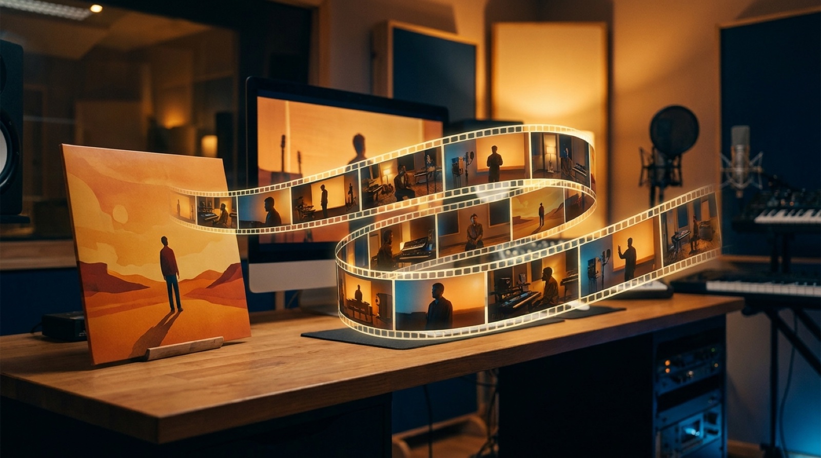
A simple workflow for SceneLore
Start with the cover image and the finished song. Write one visual sentence that describes the world of the artwork. Then create a short scene list that follows the song structure.
Use the cover as the anchor for character, palette, mood, and framing. Let the song decide where the video grows or pulls back. Keep checking whether the frames still look like the same release.
SceneLore is useful here because it is built around music video storytelling, not just isolated image generation. The cover image gives the visual direction. The song gives the timing. Your job is to keep both connected until the final frame.
If the cover already feels like the song, you are halfway there. The video should not replace that identity. It should make it move.
FAQ
Can I make a full music video from one cover image?
Yes. One cover image can guide a full video if you use it as a reference for the subject, color, mood, and scene style. The video still needs motion and structure, but the image can hold the identity together.
Should every scene look exactly like the cover?
No. Scenes should feel related to the cover, not frozen inside it. Change the camera angle, scale, and action while keeping the same visual world.
Turn your cover image into a music video
Upload your song and artwork, then build a video that keeps the same world from first frame to final chorus.
Create Your First Video