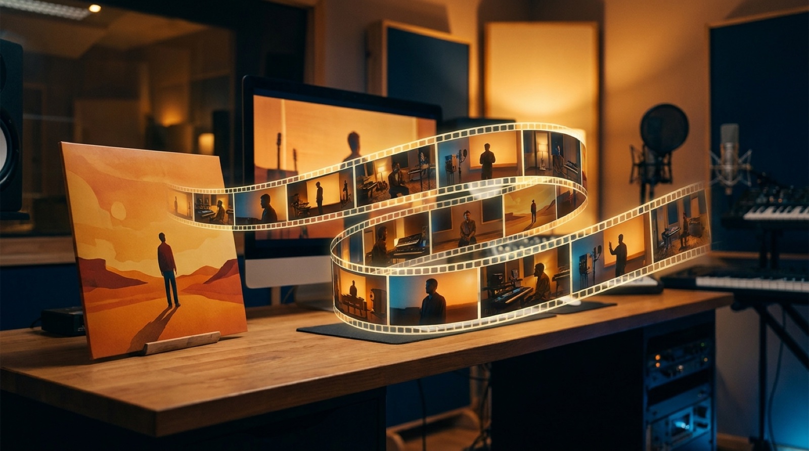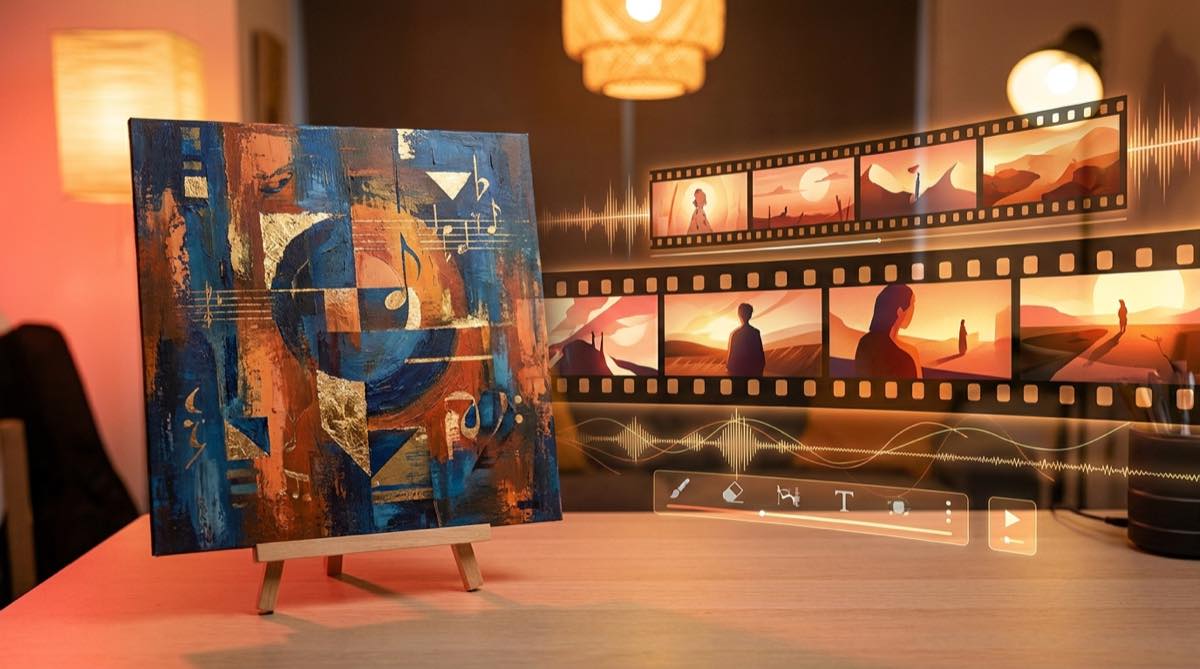
An album cover release campaign starts with a simple promise: the first image people see should match the world they enter when they press play. If the cover is cold blue, lonely, and cinematic, the video should not open like a neon club reel unless the song earns that turn. If the cover feels handmade and intimate, the thumbnail and clips should not suddenly look like stock sci-fi.
This does not mean every asset has to copy the cover. That gets stiff fast. The better move is to treat the cover as the source of truth for mood, color, subject, and stakes, then let the video and launch assets expand from there.
Decide what the cover promises
Before you make a video, write down what the cover is telling the listener. Is it a breakup song with one person in a room? A dark synth track with a city at night? A sunny pop single built around movement and friendship? Keep it plain. One sentence is enough.
Then pull out four visual rules from the image: the main subject, the dominant colors, the emotional weather, and one detail that could repeat. That detail might be a red jacket, a mirror, a train platform, a desert sky, or a handwritten title style. You are looking for things that can survive across formats.
Build the full video before the small assets
The music video should be the anchor because it carries the most time. Once the video has a clear visual spine, the thumbnail, short clips, and teaser stills can come from real moments instead of being invented as separate mini-projects.
A good order is simple: cover image, song brief, scene plan, full video, thumbnail, short clips, launch posts. If you start with short clips, the campaign often starts chasing whatever looks loudest in the first three seconds. That can get attention, but it may not sell the song you actually made.
SceneLore is built around this kind of source-led workflow. You can start from a finished song or image, then use the same visual world across the full video instead of stitching together random shots by hand. If you are new to the tool, the SceneLore homepage explains the basic song-to-video flow.
Make the thumbnail feel inevitable
The thumbnail is not a poster for the tool. It is the front door to the song. It should look related to the cover while adding a little more motion, conflict, or expression. A face can turn toward the camera. A car can sit under different light. A lonely bedroom can show one object out of place.
YouTube gives creators control over custom thumbnails, and that choice matters because the thumbnail is often judged before the title or chorus gets a chance. Use that space to make the cover's promise easier to read at a small size, not to introduce a new visual idea at the last second.
Pull short clips from the strongest turns
Short clips work better when they come from real turns in the song. Pick the first chorus, a lyrical image, a beat drop, or the moment where the visual world changes. Keep the cover colors and subject visible enough that the clip still feels like the same release when it shows up away from YouTube.
For vertical clips, do not just crop the whole frame and hope. Choose moments with a strong center subject, simple background, and readable movement. If a clip needs a caption, keep it tied to the song or release idea. A caption that sounds like generic promo can make an otherwise good clip feel cheap.
Use platform assets without splitting the identity
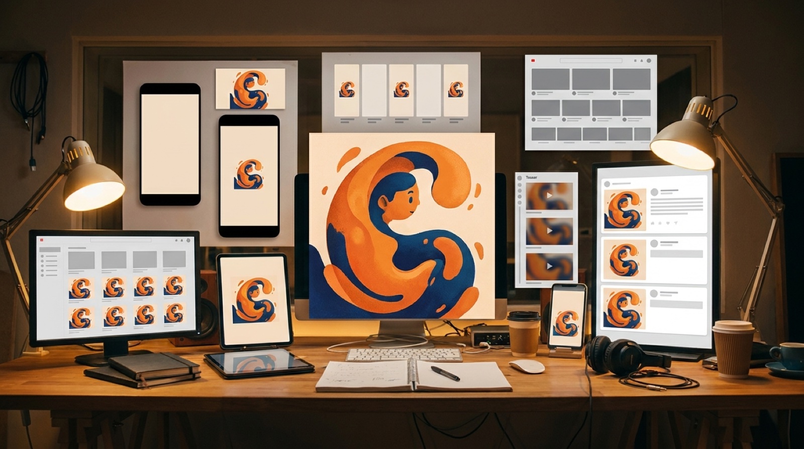
Each platform has its own visual slot. YouTube wants a strong thumbnail. Spotify has Canvas for short looping visuals, and Spotify for Artists describes Canvas as a visual layer that can play with a track. Social platforms reward vertical motion. A release page may need a hero still. Treat the Spotify Canvas loop as one small part of that same campaign, not a separate visual idea.
The mistake is treating each slot as a fresh design brief. Keep one small asset sheet instead: cover, video hero frame, thumbnail frame, three clip moments, two stills, color notes, and the final CTA. That is enough to keep the campaign from drifting.
Give every asset one job
The cover should make the release recognizable. The full video should make the song watchable. The thumbnail should earn the click. Short clips should prove there is a moment worth hearing. Teaser stills should remind people what world the song belongs to.
Once every asset has a job, the campaign gets easier to judge. If a clip looks good but has nothing to do with the cover, save it for another song. If a thumbnail is accurate but too quiet, push the expression or composition without changing the world. If a teaser post explains too much, let the image and one clean line do the work.
A quick release-pack checklist
- One sentence describing the cover's mood.
- Three visual rules that must carry into the video.
- One full music video built before the clips.
- One thumbnail that feels like the cover in motion.
- Three vertical clips from real song moments.
- Two still frames for launch posts or a release page.
If the same listener could see all of those assets in a feed and know they belong to one song, the campaign is doing its job.
FAQ
What should an album cover release campaign include?
A useful album cover release campaign usually includes the main cover, a full music video, a YouTube thumbnail, a few short clips, teaser stills, and launch posts that all share the same mood.
Can one cover image guide a whole music video campaign?
Yes. One strong cover image can guide the color, subject, lighting, and emotional promise of the video campaign, as long as you let the scenes move beyond the flat artwork.
Turn your cover art into a release video
Upload your song or cover image, then build a full music video you can use for YouTube, short clips, thumbnails, and launch posts.
Create Your First Video