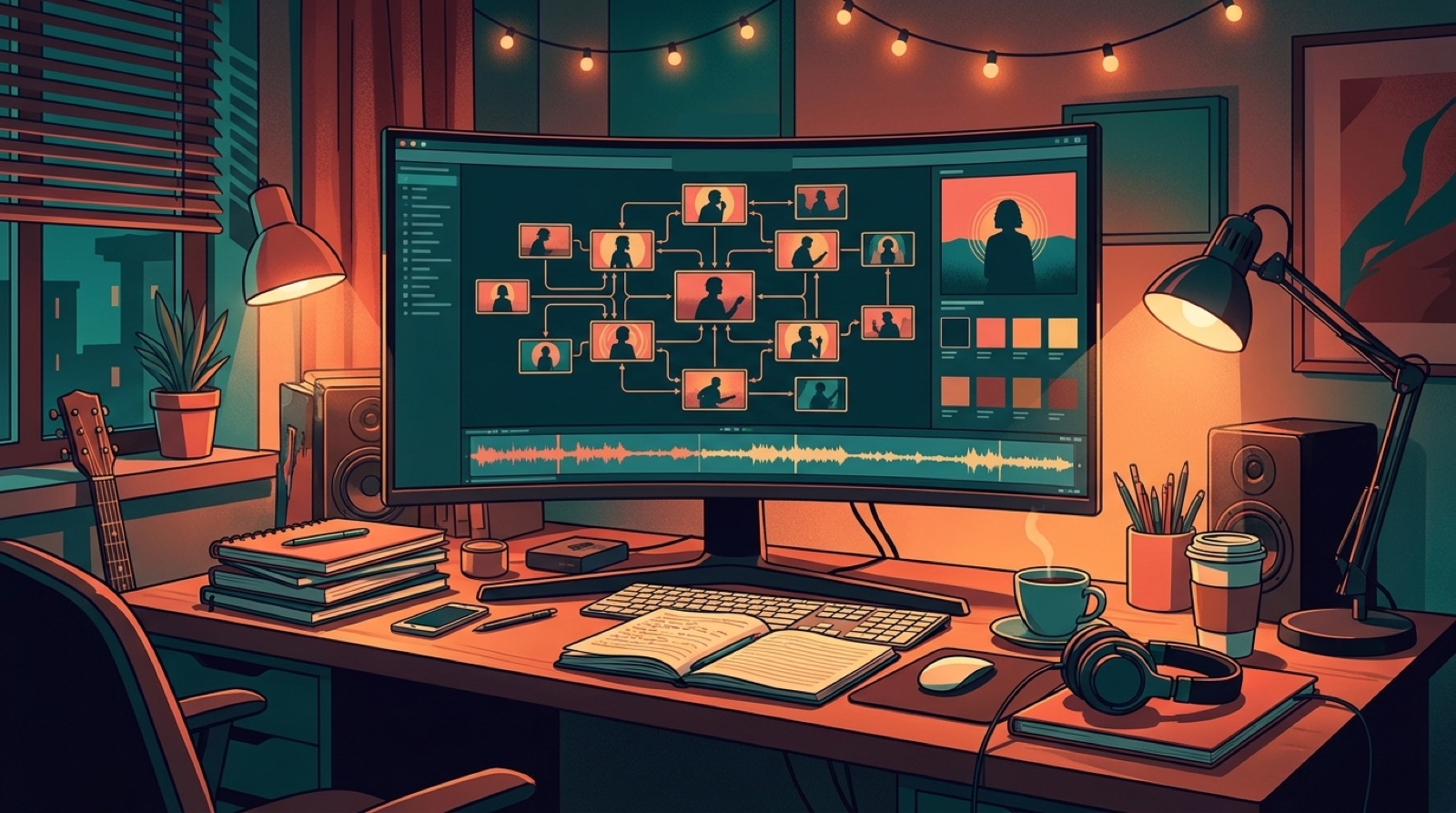
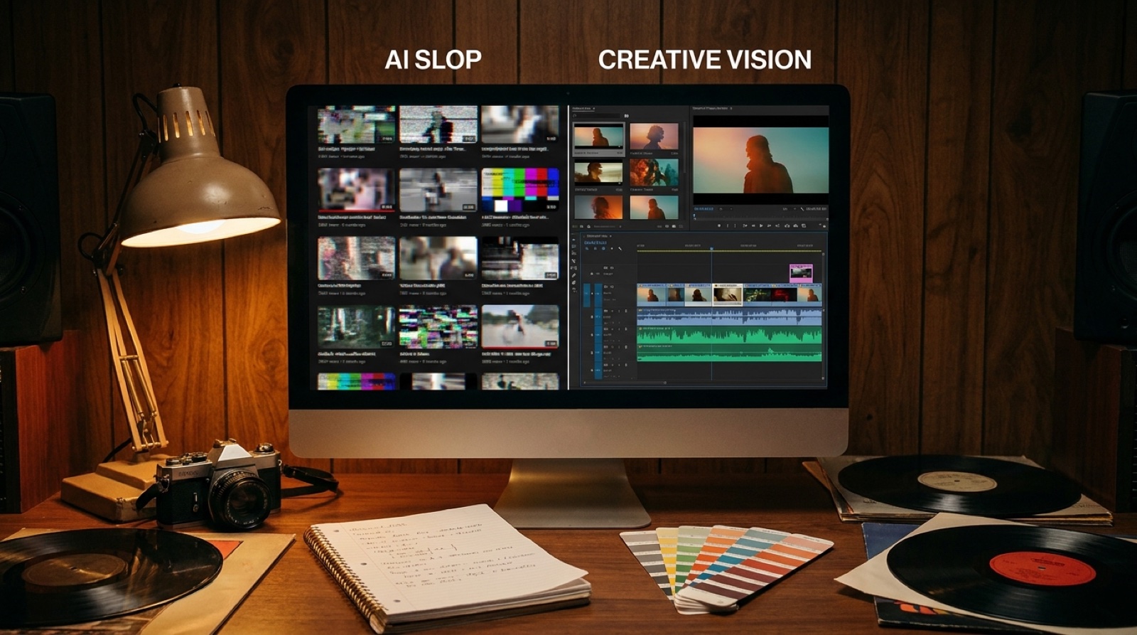
The generic AI visualizer look is easy to spot. A waveform pulses in the middle. Particles float around it. A tunnel, nebula, or abstract city loops behind the beat. It may move, but it does not say much about the song.
That is fine for a quick demo. It is weak for a release you want people to remember.
A better AI music visualizer starts with art direction. It gives the song a subject, a color world, a few scene changes, and a reason to keep watching. YouTube reminds creators that thumbnails give viewers a quick snapshot of a video, and the same idea applies to the first frame of a music video. The viewer decides fast whether the release looks intentional.
Pick one visual anchor before you animate anything
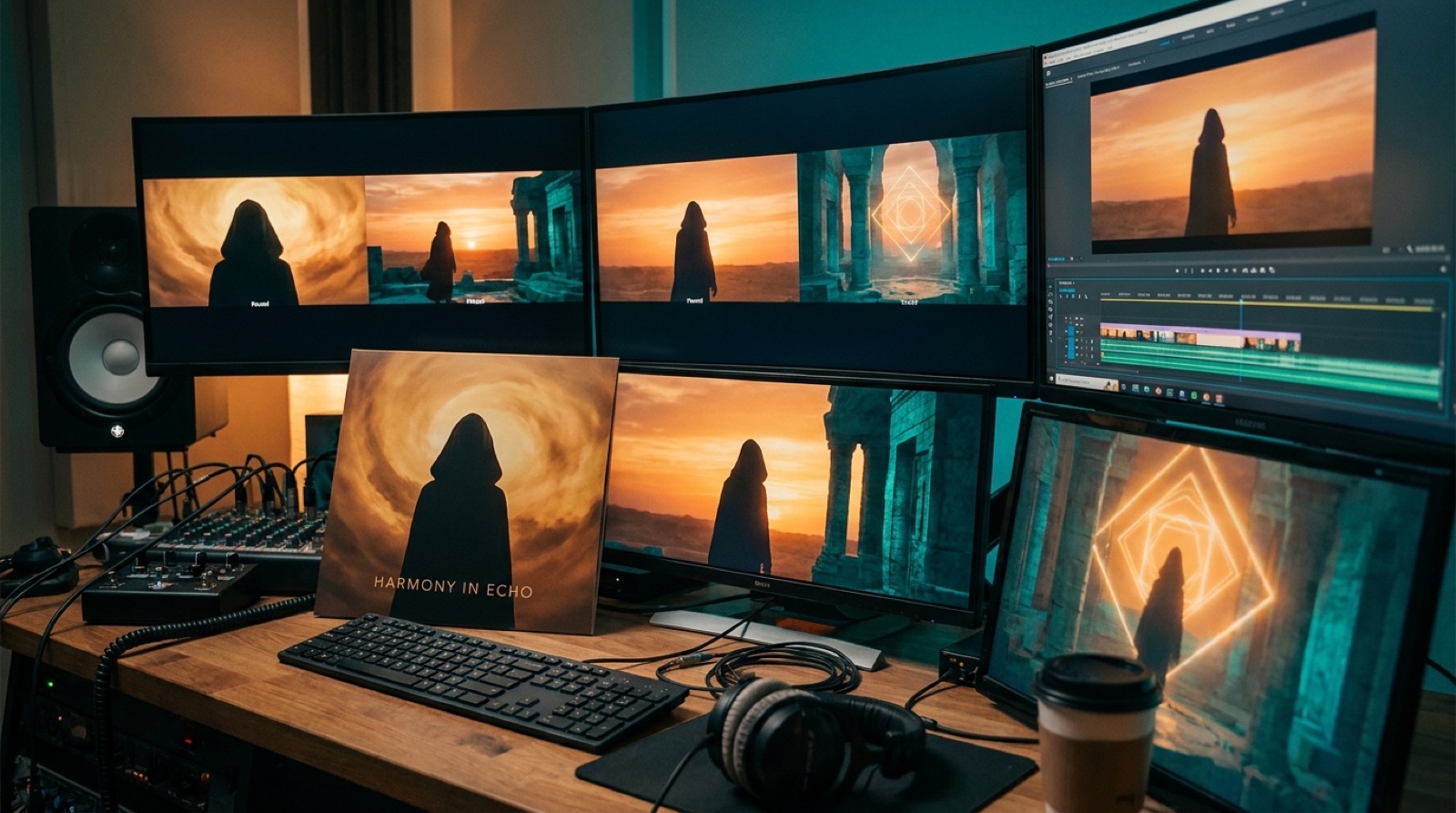
A visual anchor is the thing the viewer can recognize across the video. It can be a character, a room, a car, a mask, a city street, a cover image, or even one strong object from the lyrics.
Without an anchor, the video has to lean on motion alone. That is how you end up with a nice-looking loop that feels detached from the song.
Choose the anchor before choosing effects. If the song is a lonely synth track, maybe the anchor is one driver crossing a rainy city. If it is a dark pop song, maybe it is a performer in a red-lit apartment. If it is lofi, maybe it is a quiet desk, a window, and one recurring character.
SceneLore works best when you start with this kind of anchor. A finished song plus a cover image or core visual gives the video something to protect across every scene.
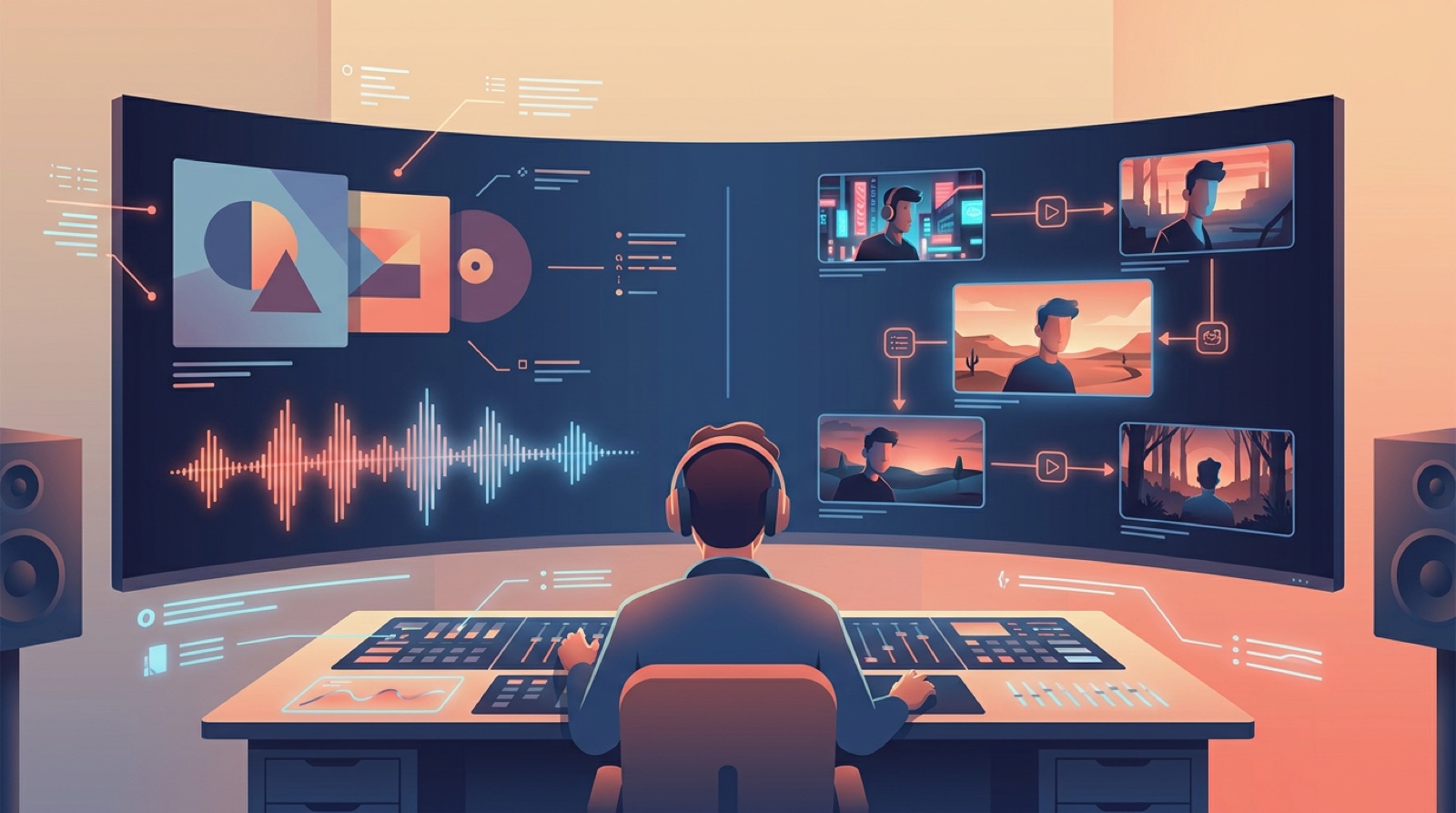
Use song structure instead of constant motion
Generic visualizers move all the time, but they rarely change in a way that matches the track. The intro, verse, chorus, bridge, and ending all get the same treatment.
Map the song first:
- Intro: establish the anchor and mood.
- Verse: keep the camera calmer and let the world breathe.
- Chorus: widen the scene, raise the color, or reveal the strongest image.
- Bridge: introduce a contrast, memory, or visual break.
- Final chorus: return to the anchor with more energy.
You do not need a complicated plot. You need change that feels earned by the music.
Build a color rule, then stick to it
Color is one of the fastest ways to make a release look planned. Pick two main colors and one accent before generating scenes. Keep those choices tied to the song mood.
For example, a cyberpunk track might use teal shadows, amber signs, and a small red accent. A soft indie song might use warm window light, muted greens, and pale blue night scenes. A metal track might use hard contrast, smoke, steel, and one bright stage color.
The point is control. If every scene has a different palette, the video starts to look like a tool test. If the palette holds, even varied shots feel like they belong to the same release.
Make the first frame pass the thumbnail test
Before you render the full video, freeze the first frame and ask a harsh question: would this make someone curious about the song?
If the frame only shows a waveform, it is probably weak. If it shows the artist world, the emotional tone, or a strong object from the song, you have more to work with.
This matters beyond YouTube. The same frame can shape short clips, release pages, social posts, and playlist pitches. A useful first frame becomes part of the release package, not just the start of the upload.
Avoid fake complexity
Some AI music videos look busy because the creator is trying to hide that there is no idea. Fast cuts, random textures, sudden camera moves, and too many visual styles can make a video feel cheaper, not richer.
Use fewer rules:
- One anchor.
- One color system.
- Four or five planned scene beats.
- Motion that fits the genre.
- A thumbnail frame that sells the mood.
That is enough for many songs. The viewer does not need to know how complex the production was. They need to feel that the video belongs to the track.
Turn the visualizer into release assets
The strongest test is whether the visual system works after upload. Can you pull a thumbnail from it? Can the chorus become a short clip? Can the cover image, video, and release page look related?
If the answer is yes, the video is doing more than filling the screen. It is helping the song travel.
If the answer is no, you probably made a background, not a release asset. That is the difference between a generic AI visualizer and a music video people can remember.
Start with one anchor, map the song structure, keep the colors disciplined, and make the first frame worth clicking. The video will still be fast to make, but it will feel like it came from an artist, not a preset.
FAQ
What makes an AI music visualizer look generic?
It usually looks generic when the video depends on waveforms, abstract tunnels, particles, and random clips without a visual anchor tied to the song.
Is a visualizer ever enough for an AI song?
A visualizer can be enough for a demo, background upload, or quick loop. A single, campaign, or YouTube-first release usually needs stronger packaging.
How do I make an AI music visualizer feel more like a music video?
Start with one visual anchor, map scene changes to the song structure, keep color and framing consistent, and use the final video assets across thumbnails, clips, and release pages.
Related guides
Make the release look as specific as the song
Use SceneLore to turn a finished track, cover image, or visual anchor into a full music video and launch assets that feel connected.
Create Your First Video