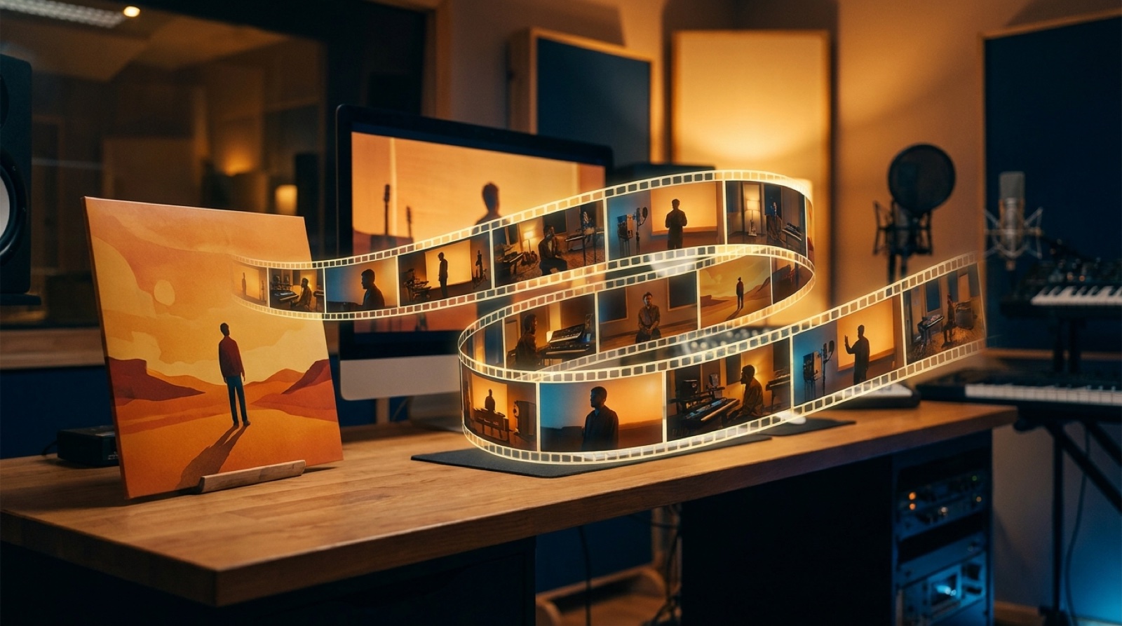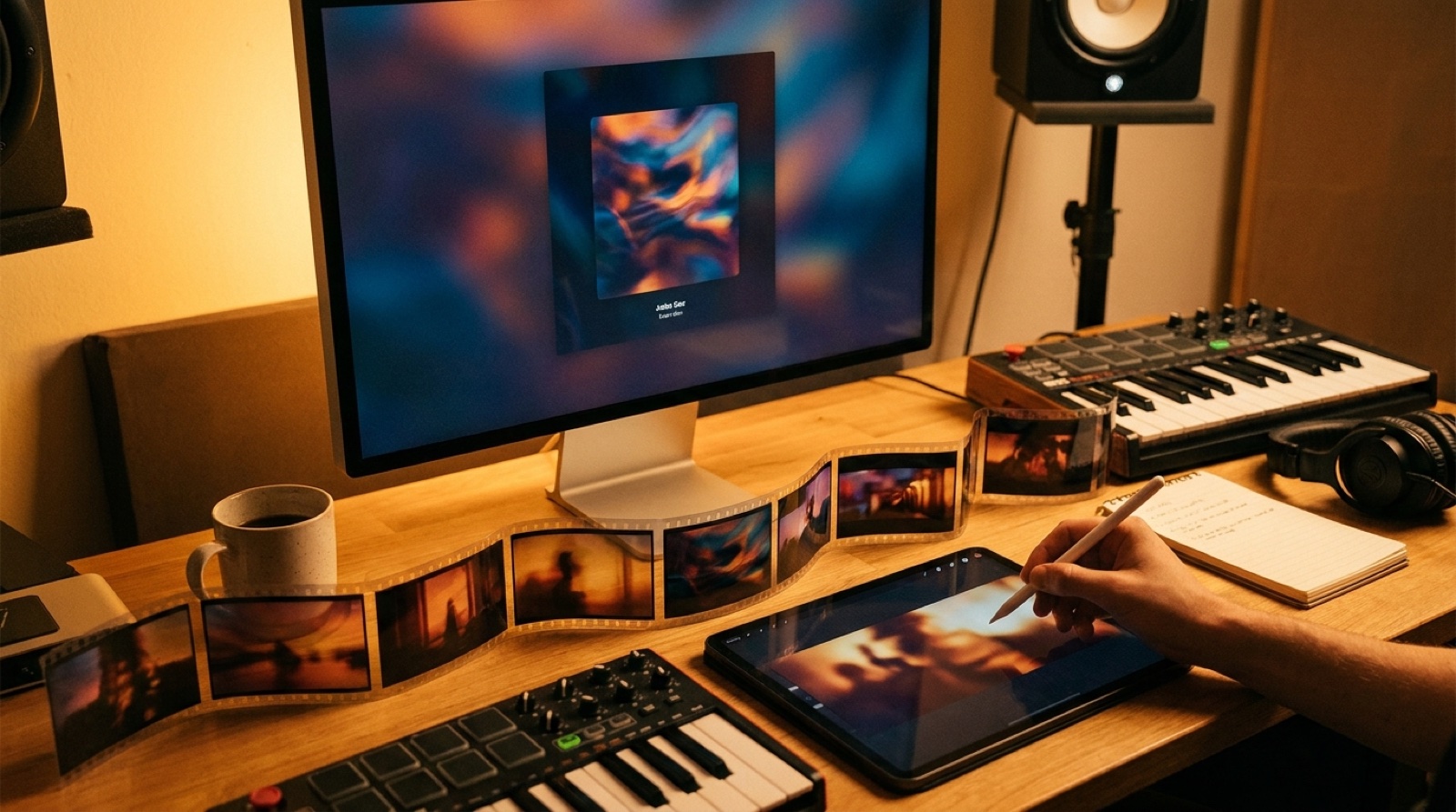
An AI cover art video should make the cover feel alive, not replace it with a random set of clips. The cover already did hard work. It picked the color, the mood, the face or object, and the first promise of the song.
The video has to respect that promise. If the cover feels lonely, the motion should not suddenly become a crowded neon chase. If the cover feels dusty and acoustic, the scenes should not drift into glossy science fiction unless the song asks for that turn.
Start with the image, then make every video choice prove that the same release world still exists.
Read the cover before you animate it
Before you write prompts or choose scenes, describe the cover in normal words. Do not start with effects. Start with what the listener should feel.
Write down:
- The main subject or object
- The dominant colors
- The camera distance
- The emotional temperature of the image
- One detail that could move naturally
A cracked window can catch rain. A singer on a rooftop can turn toward city lights. A hand-drawn creature can blink, breathe, or walk through the same painted world. Small motion often works better than forcing the cover into a totally new scene.
Choose one visual anchor
The anchor is the thing the audience can recognize from the cover after the video begins. It might be a character, a room, a car, a symbol, a color pairing, or the exact lighting mood.
Pick one anchor and protect it. If every shot changes the subject, palette, and setting, the video stops feeling like cover art in motion. It becomes a mood board.
A strong anchor gives you freedom. You can move from close-up to wide shot, from verse to chorus, or from stillness to motion because the viewer still knows what world they are in.
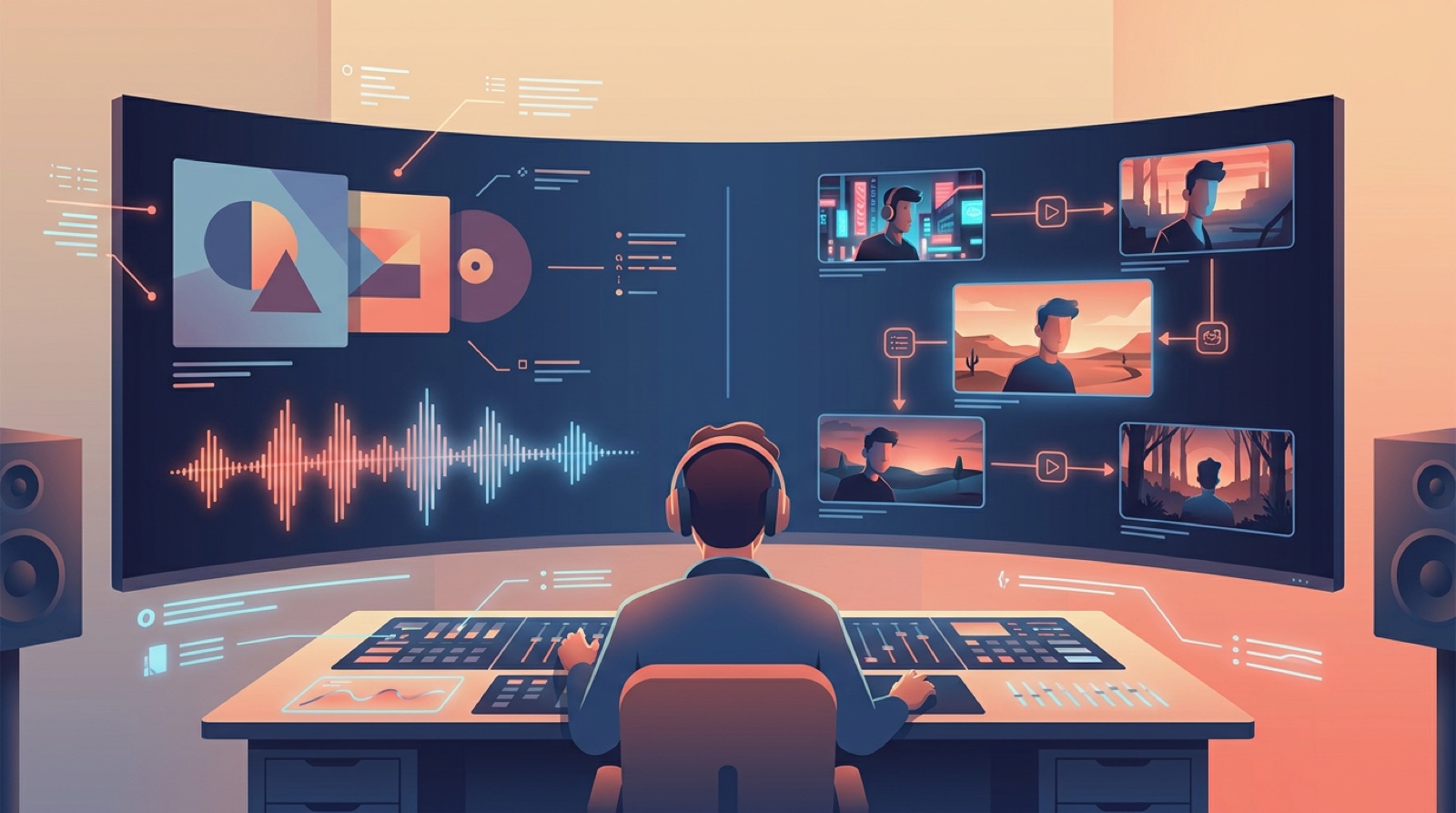
Turn the song structure into motion
The cover does not need to move at the same speed for the whole track. Let the song decide where motion grows.
Use the intro for the smallest change: light flicker, slow camera push, dust, smoke, rain, or a hand entering frame. Let the verse open the setting. Let the chorus reveal the strongest version of the cover world.
This keeps the video from feeling like a screensaver. The cover remains the source, but the song gives it shape.
Keep the color story tight
Color drift is one of the fastest ways to lose the mood. A cover with deep red, cream, and shadow should not turn into blue lasers halfway through unless the song has a clear reason for that shift.
Use the cover palette as a rule, not a suggestion. Add one accent color if the chorus needs lift. Keep the rest close to the source image.
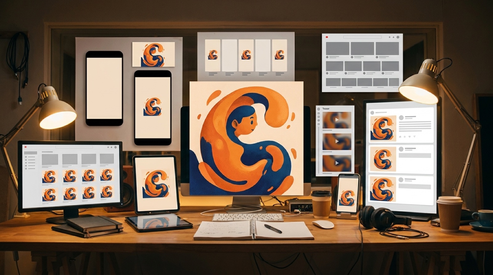
This also helps the release assets feel connected. The thumbnail, short clips, YouTube upload, and release page can all look like they belong to the same song.
Avoid motion that breaks the cover
Some animation choices look impressive for two seconds and then damage the identity of the release.
Be careful with:
- Face changes that make the artist or character feel like someone else
- Random camera spins that fight a quiet song
- New backgrounds that ignore the cover setting
- Overloaded effects that hide the original image
- Text inside the video frames that competes with the artwork
The best version usually feels like the cover had more room to breathe. It does not feel like a different artist took over the release.
Use the full video when the release needs more than a loop
A simple animated loop can be enough for a Spotify Canvas-style asset or a quick social post. Spotify describes Canvas as a short looping visual that plays with a track, which is a different job from a full YouTube music video. You can see the basic format in Spotify for Artists' Canvas help page.
A full AI cover art video makes sense when you need more material from the same visual world:
- A YouTube upload people can watch through the whole song
- A thumbnail that matches the cover
- Vertical chorus clips
- Teaser stills for release posts
- A visual direction you can reuse for the next single
If the release only needs one small motion asset, keep it simple. If the cover can carry the whole campaign, build a fuller scene plan around it.
A simple cover-to-video workflow
Use this order before you render anything expensive:
- Write one sentence for the cover mood.
- Pick one anchor that must stay recognizable.
- Map the intro, verse, chorus, and ending to changes in motion.
- Choose two or three scene types that all belong to the cover world.
- Keep the color palette close to the original image.
- Export one short test before building the full video.
The short test matters. If the test clip already feels like a different release, the full video will only make that problem louder.
Use SceneLore when the cover already has the mood
SceneLore works best when you start with a finished song and a visual anchor that deserves to be protected. Cover art is often that anchor.
Upload the track or start from the cover direction, then build the video around the same subject, palette, and emotional feel. The goal is not to make the busiest video. The goal is to make the cover feel like it always had a world behind it.
FAQ
Can I turn cover art into a full music video?
Yes. Start with the cover art mood, choose a few details that can move, then build scenes that feel like they came from the same image instead of replacing the image with unrelated shots.
What should stay consistent when animating cover art?
Keep the color palette, main subject, camera mood, typography-free composition, and emotional tone consistent. Motion should support the cover, not rewrite the identity of the release.
When is a loop enough instead of a full video?
A loop is enough when the song only needs a Canvas-style asset or a small social post. A full video makes more sense when the release needs YouTube, short clips, a thumbnail, and a larger visual story.
Turn the cover into a connected video
Bring the finished song or cover direction into SceneLore, choose the visual anchor, and build a release video that keeps the mood intact.
Create Your First Video