AI music cover art variants are easy to treat as an afterthought. You make one square cover, upload it everywhere, and hope the release still feels designed.
That usually breaks fast. The YouTube thumbnail needs space for a title. A vertical clip needs a tall composition. A release page hero needs breathing room. A Canvas loop needs a frame that can move without making the cover feel warped.
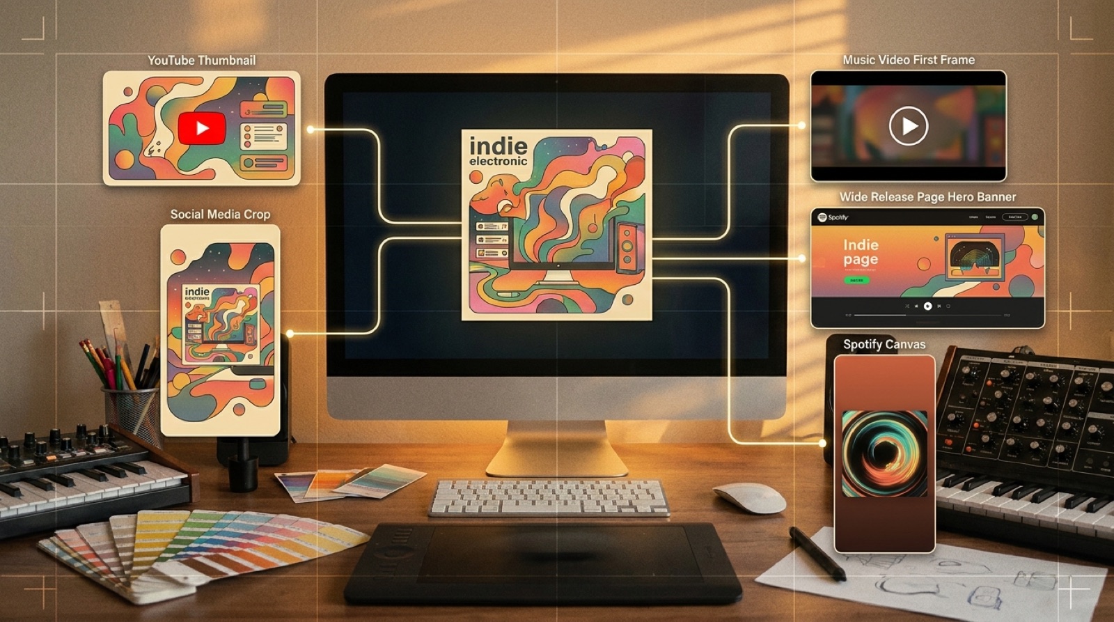
The goal is not to make a dozen unrelated images. The goal is to build a small visual family from one cover so the song looks like a real release wherever someone meets it.
Start with the anchor, not the crop
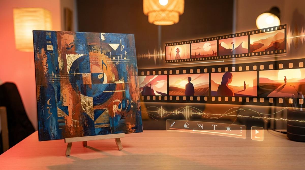
Before you resize anything, name the thing the cover has to protect. It might be a character, color, object, room, landscape, or symbol. That anchor is what makes every variant feel like the same song.
If the cover's strongest feature is a face, do not crop the vertical version through the eyes. If the strongest feature is a lonely red car, do not make the thumbnail so busy that the car disappears. If the mood depends on blue night lighting, keep that color rule across the asset set.
SceneLore has a deeper guide on using one image as a visual anchor in how to make one cover image carry a full music video.
Build the YouTube thumbnail as its own asset
A YouTube thumbnail is not just the cover art in a wider box. It has to read in a feed, on a phone, beside titles, and inside a channel grid.
Give the thumbnail a stronger focal point, cleaner contrast, and enough empty space for any title treatment you actually plan to use. If the square cover has beautiful detail everywhere, the thumbnail may need a calmer background so the promise lands faster.
Keep the same world, but make the job different: the cover confirms the release identity; the thumbnail earns the click.
Make a vertical crop before you need Shorts
Shorts, Reels, and TikTok punish lazy crops. A square image centered in a vertical frame often feels like a poster floating in dead space. A stretched crop feels worse.
Plan one vertical version while the visual world is still fresh. Extend the environment, stack the subject and background, or choose a detail that can carry a phone screen. Leave room for captions, lyric fragments, or platform UI without covering the best part of the image.
This is especially useful when the chorus becomes a short clip. The vertical asset should feel like it belongs to the full release, not like a rushed promo after the upload.
Choose a first frame for the full video
The first frame does a different job from the cover. It has to begin motion. It should make the viewer feel that the world can open up, not that the video is stuck staring at album art.
Pick a version with direction: a road leading into the scene, a character looking toward something, a light source pulling the eye, or a composition that can support camera movement. If the first frame is too symmetrical or too finished, the video may feel like it has nowhere to go.
A first-frame test can save a lot of wasted rendering. Use the cover variant that makes the song feel watchable from second one.
Give Canvas and loop assets less to prove
Spotify Canvas and other loop formats do not need to tell the whole story. They need to support the mood without distracting from the track.
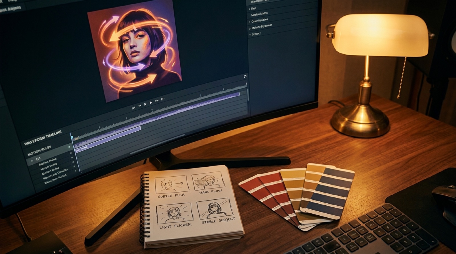
Choose a variant with one clean motion idea: drifting light, slow fabric movement, rain, smoke, water, a passing shadow, or a subtle camera push. Avoid cramming the full cover, title, artist mark, and character detail into a tiny loop. The loop should feel like atmosphere from the same world.
Use a release page hero to widen the world
A release page hero is where the square cover can breathe. Instead of forcing the same crop again, use a wider variant that shows the environment, mood, and visual promise around the song.
This is where you can connect the cover, video, short clips, credits, and proof note. The listener should feel that every asset belongs to one launch, not a folder of disconnected exports.
Keep a simple variant checklist
You do not need a giant brand system for every single. You need enough structure that release day does not turn into emergency cropping.
- Square cover for stores and release records.
- 16:9 thumbnail with a clear focal point and title-safe space.
- 9:16 vertical crop for Shorts, Reels, and teaser posts.
- Video first frame that can lead into motion.
- Loop frame for Canvas-style motion.
- Wide hero crop for release pages, newsletters, or banners.
- Clean source folder with export dates and filenames.
If the song later needs ads, playlist pitching, a press kit, or a channel trailer, this small set gives you a stronger starting point than one lonely square.
Do not let variants become visual drift
The danger is making every asset more dramatic until they stop looking related. A red cover becomes a blue thumbnail. The character changes face. The vertical crop introduces a new setting. The video opens in a world the cover never promised.
Use a small rule set: same main color family, same subject, same era, same texture, and one shared visual symbol. Variants should adapt the cover to each format while still making the release recognizable.
SceneLore turns a song, cover, or visual idea into a connected music video package so the thumbnail, first frame, short clips, and full video feel like one release. Create your first video when your cover needs to become more than a square.